
Visual Identity & Character Design for Children's Reading Initiative
Client: LeseEulen e.V.
Scope: Logo design, visual identity concept, character design, mascot development.
Scope: Logo design, visual identity concept, character design, mascot development.
For the children's reading initiative LeseEulen e.V., I developed a visual identity that combines typographic design with character development.
The logo integrates an owl motif directly into the letterforms, creating a playful symbol that connects the organization’s name with its educational mission.
The logo integrates an owl motif directly into the letterforms, creating a playful symbol that connects the organization’s name with its educational mission.
Building on this idea, I designed a character that extends the visual identity into a friendly reading companion for children.
The owl was developed through a series of character studies exploring posture, expression, and interaction with books, allowing the mascot to communicate curiosity, warmth, and the joy of reading.
The owl was developed through a series of character studies exploring posture, expression, and interaction with books, allowing the mascot to communicate curiosity, warmth, and the joy of reading.
The project focuses on creating a recognizable identity that balances clarity and friendliness while supporting the educational context of the initiative.
Logo development

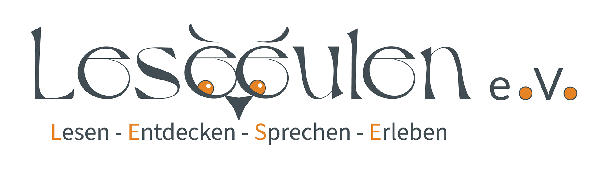
Primary Logo
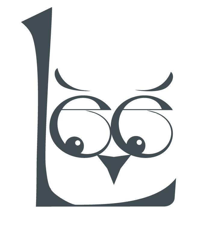
Compact Version
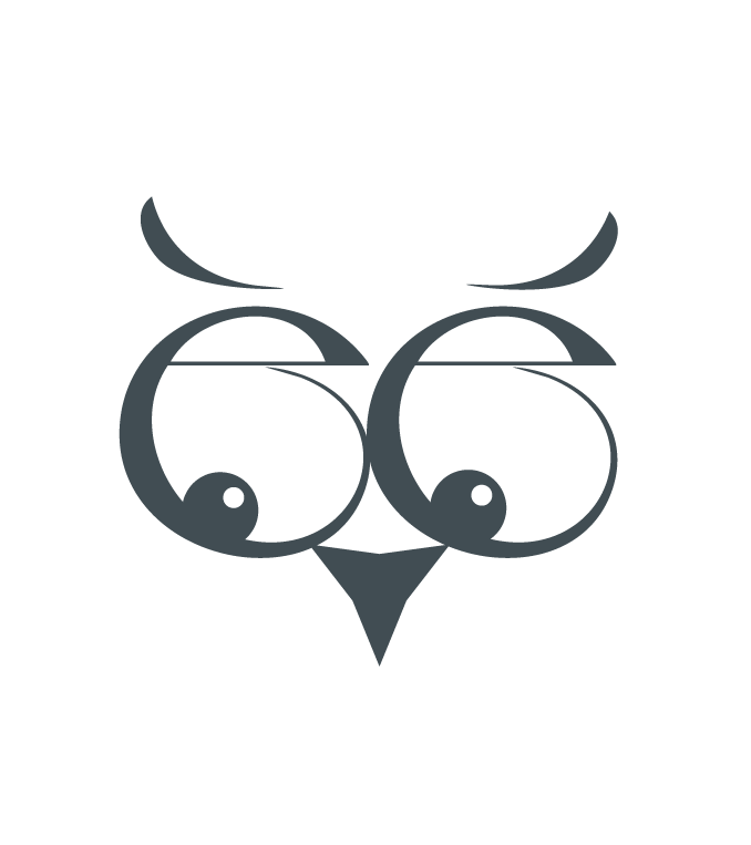
Standalone Logo Symbol
Mascot development - Character exploration for the reading mascot.

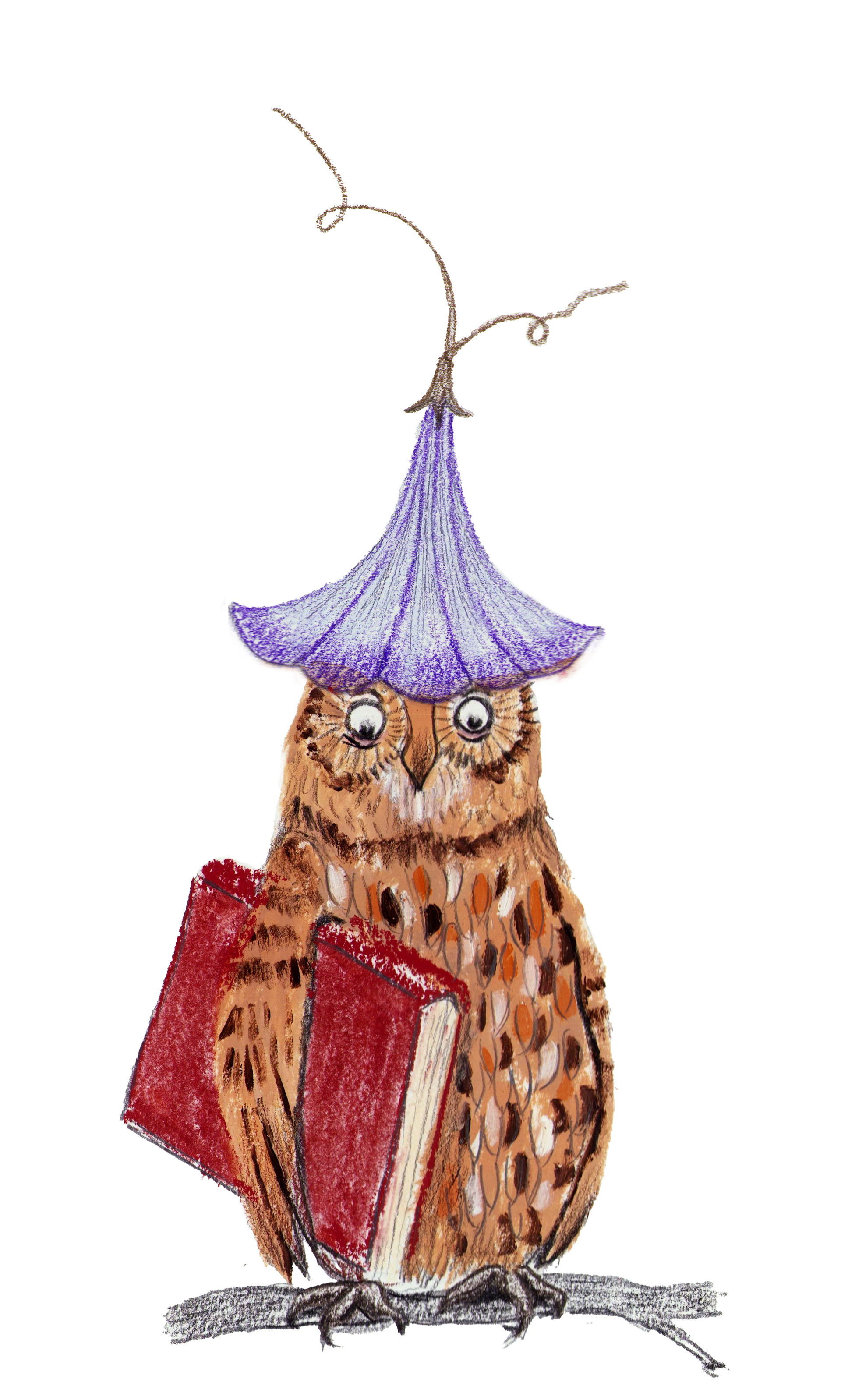
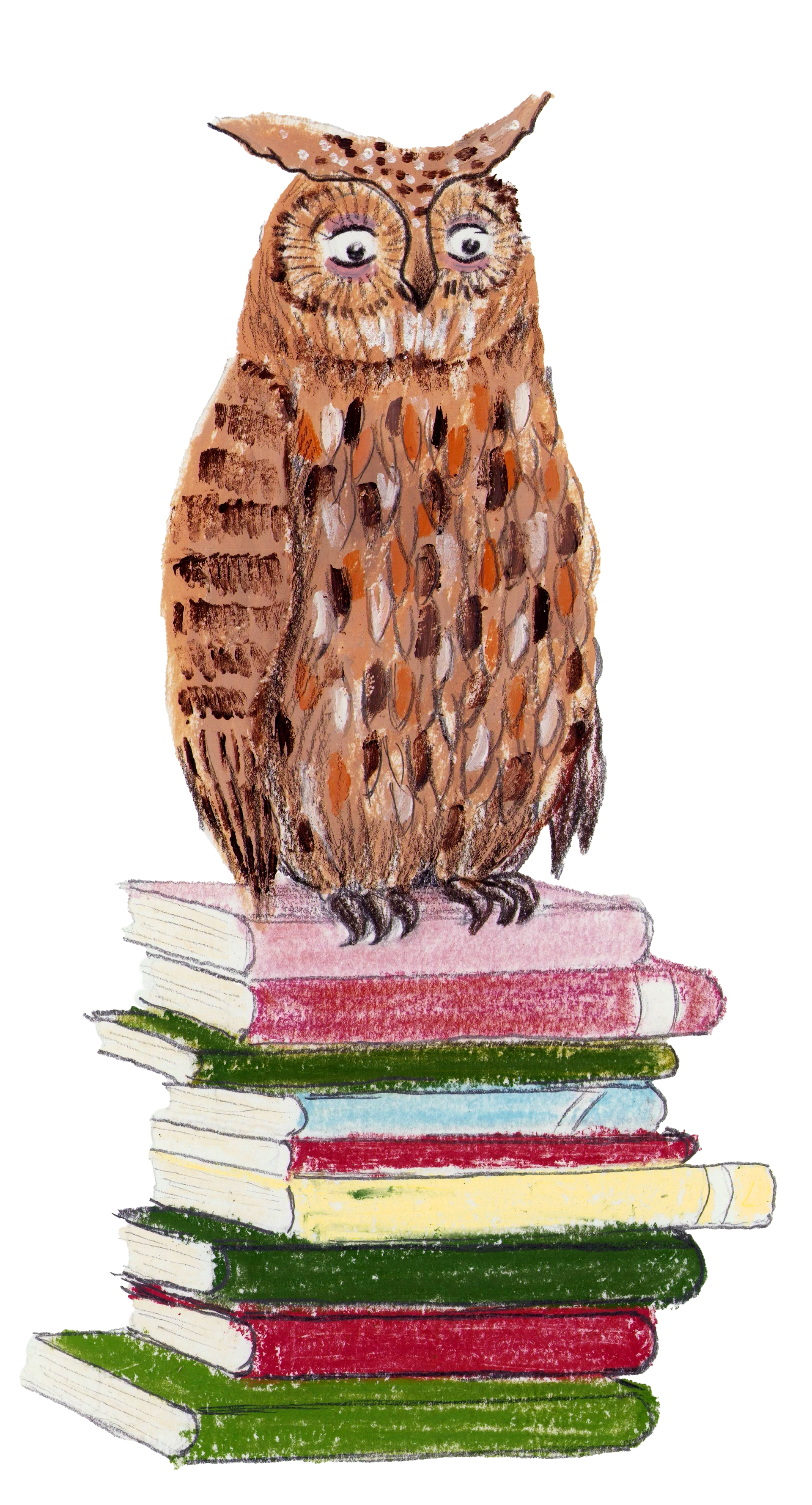
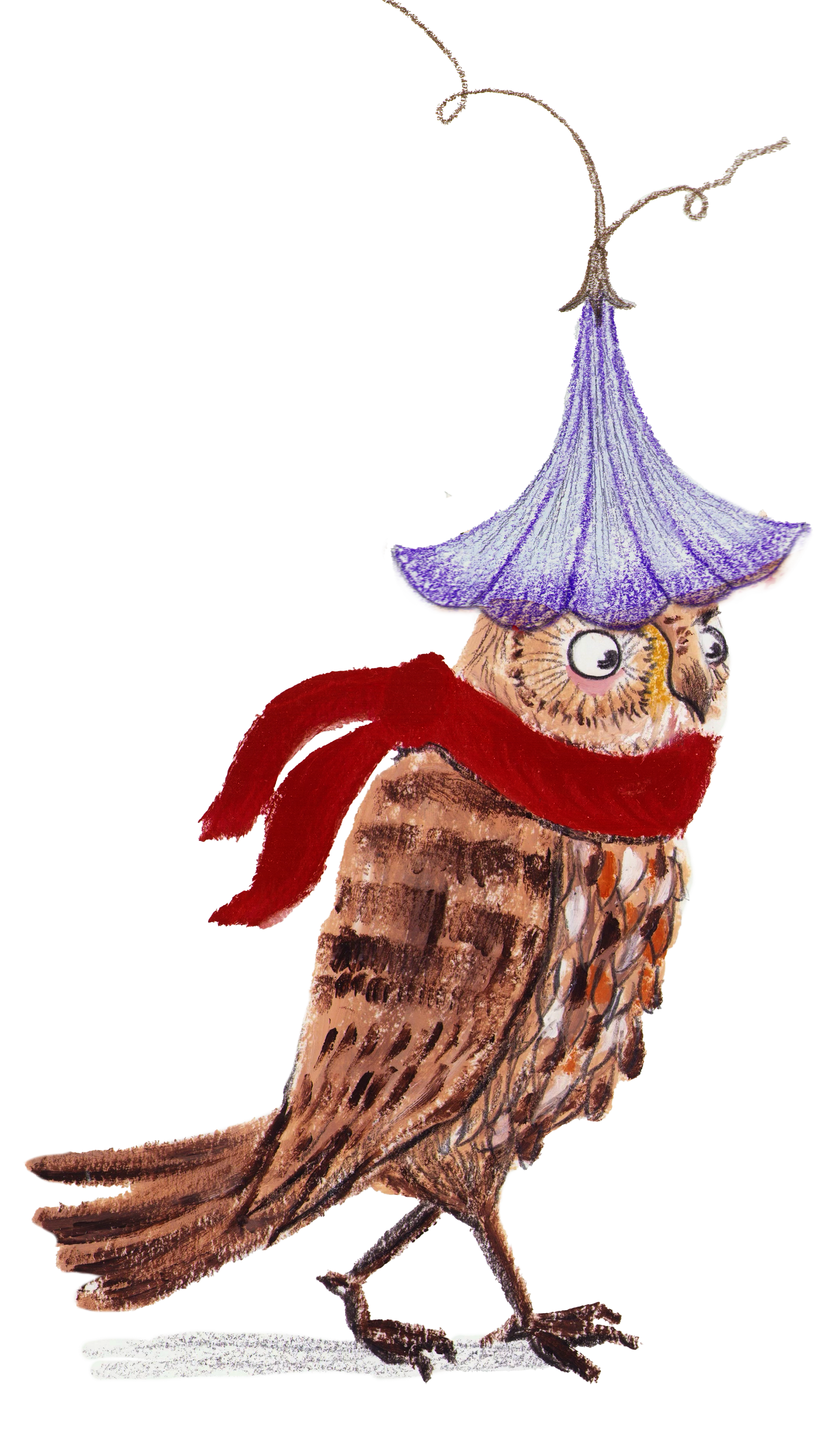
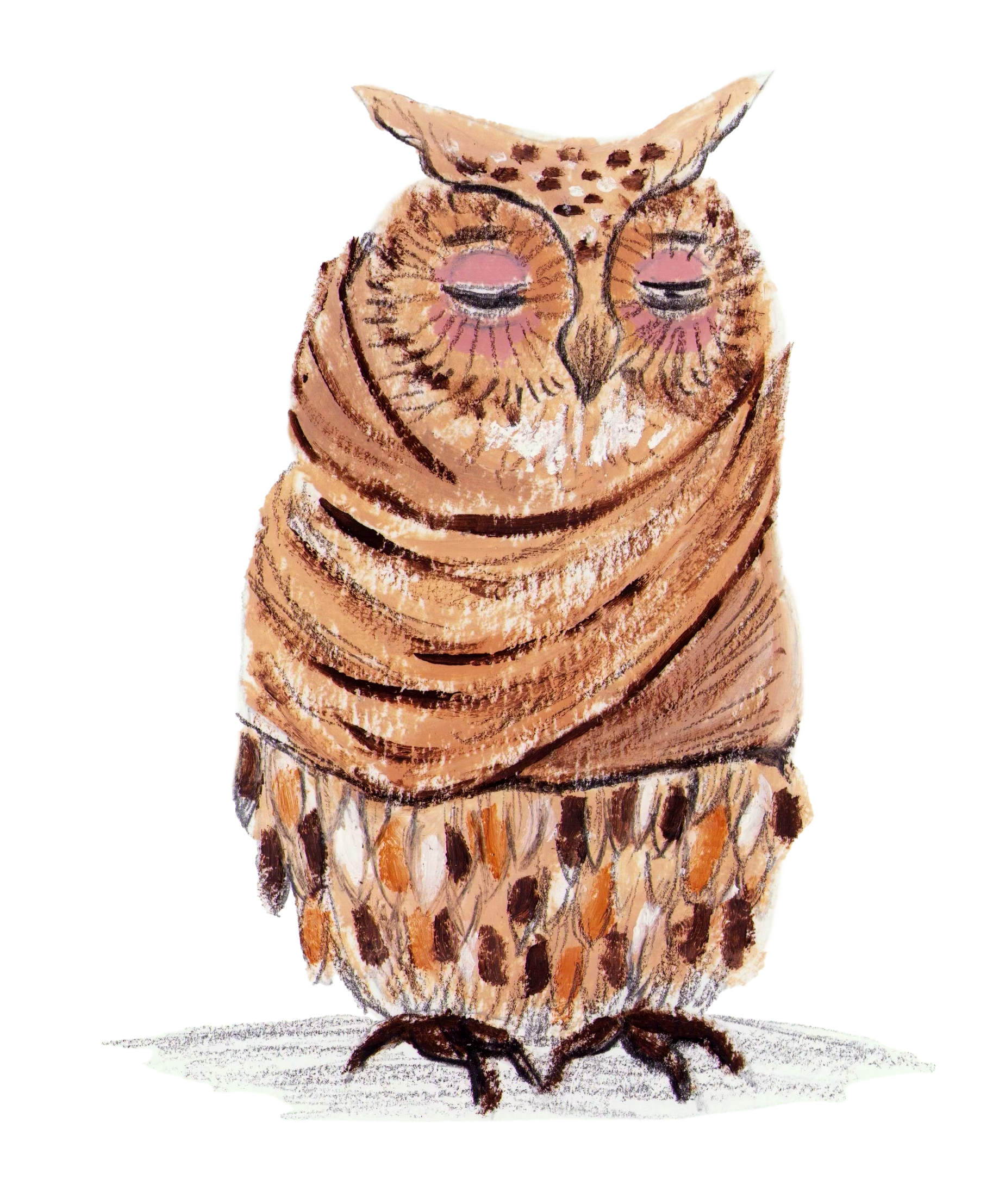
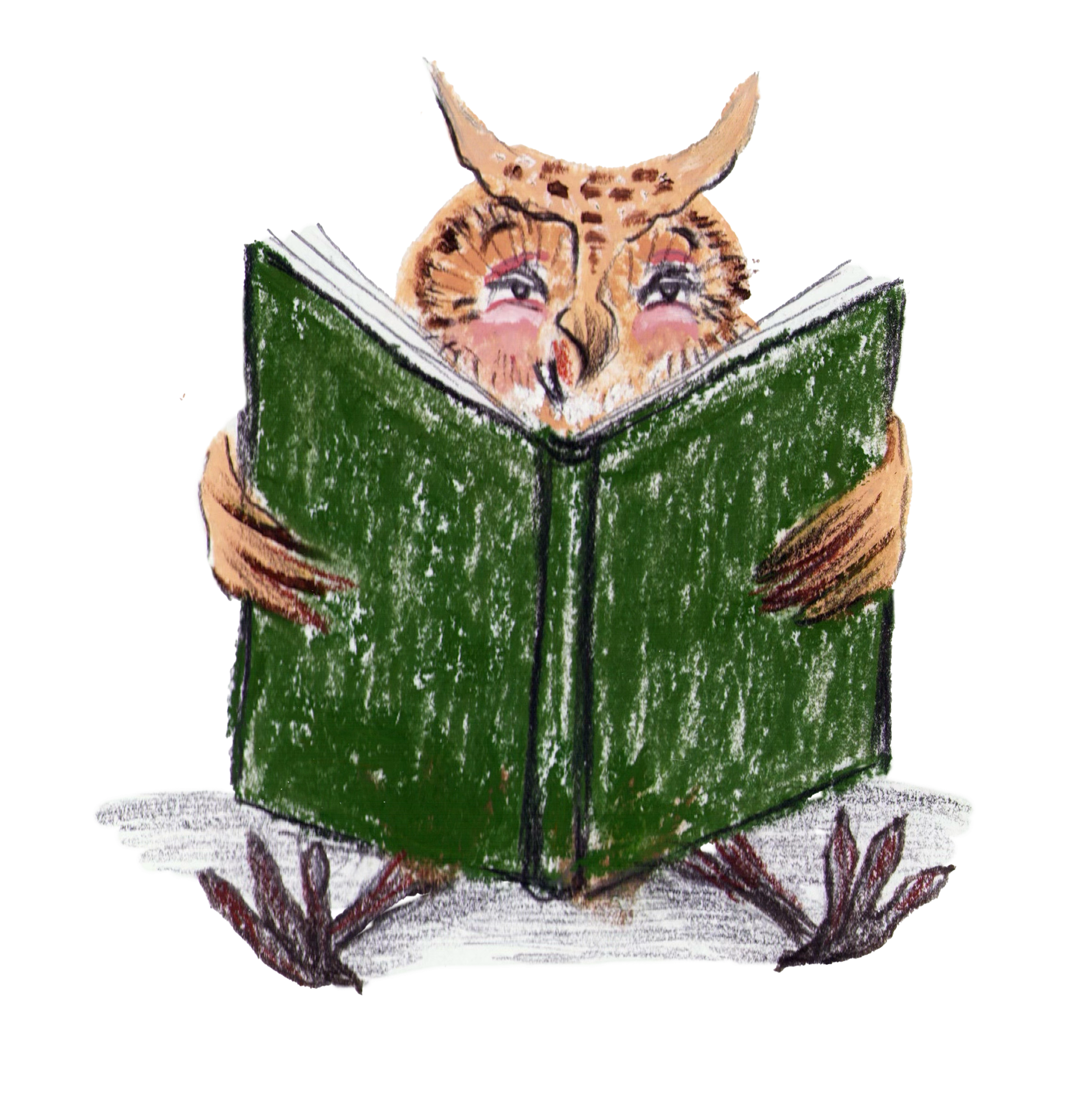
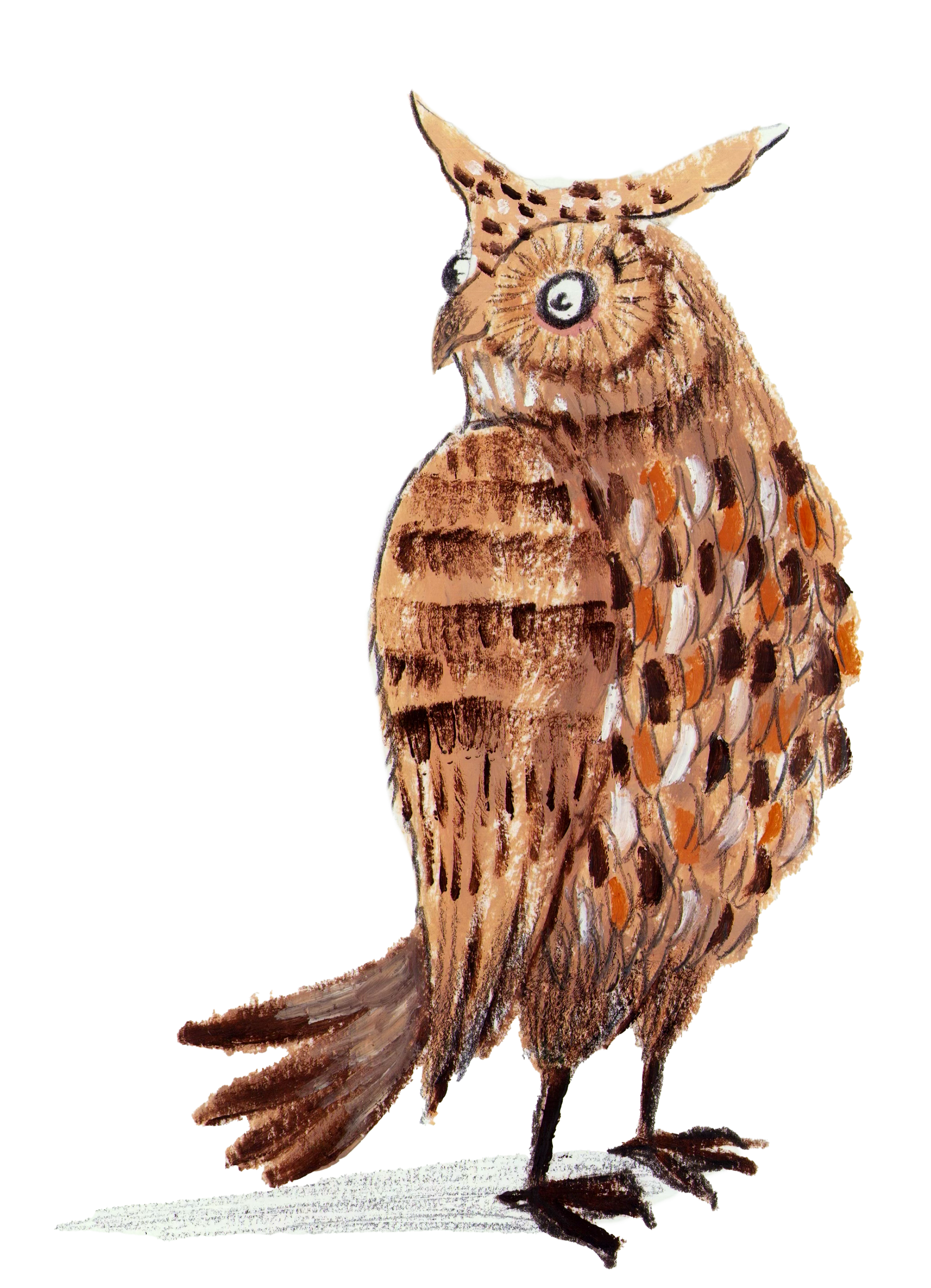
The mascot was designed to support reading activities and create a friendly character children can identify with.